With a seemingly endless pool of photography out there, how do you make your images stand out? That’s the goal of color grading. This crucial step in photo editing can utterly transform your imagery, subtly sway emotions, and give a polished, professional feel to your photos. And you can achieve stunning results using Adobe Lightroom. Whether you’re new to this game or looking to refine your skills, we’ve got you covered with this ultimate guide to color grading in Lightroom.
Understanding Color Grading
Before we dive deep into the process, it’s essential to understand what color grading is. Simply put, it’s the process of adjusting the colors in your image to create a specific mood or enhance the visual storytelling of your photo. It could be adding a warm, vibrant look to a landscape or creating a cool, blue tone for a night shot. The mood you set through color grading can be as essential as the subject of your photo itself.
Setting up Your Workspace in Lightroom
To start color grading in Lightroom, you’ll first need to set up your workspace correctly. Start by importing the photo you want to edit. After importing the photo to Lightroom, navigate to the Develop module where you’ll find all the tools for color grading.
The Basic Panel
Before diving into specific color grading techniques, ensure your photo has been correctly exposed and balanced. The ‘Basic Panel’ provides the tools for these adjustments. Here, you can adjust the exposure, contrast, highlights, shadows, whites, blacks, and clarity. Make sure that your image is balanced and exposed correctly before moving on to color grading.
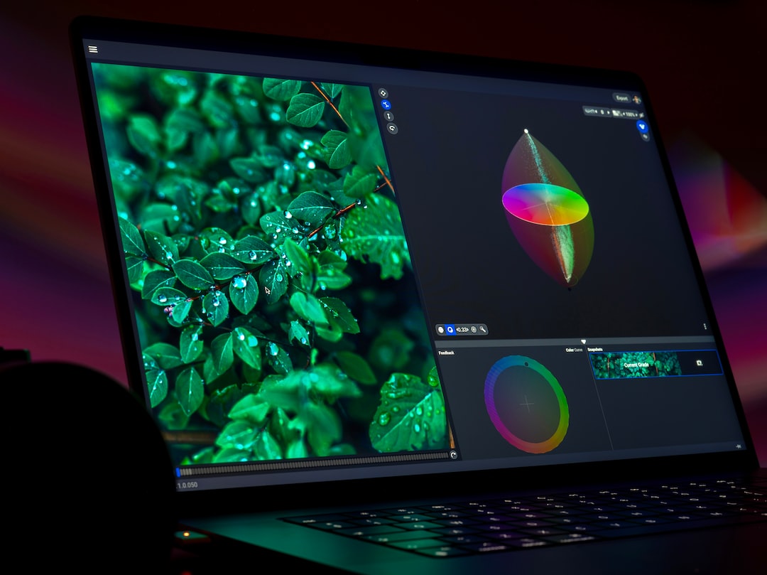
Color Grading Panel
Once your image is balanced, you’re ready to dive into the world of color grading. You’ll find the color grading tools in the panel of the same name. Here, you can adjust three different aspects of your photo separately: the shadows, midtones, and highlights. By adjusting these aspects separately, you have a superior level of control over the color grading of your image.
Shadows
The Shadows wheel allows you to add a color tone to the darkest parts of your image. This can be incredibly impactful in setting mood and atmosphere, as shadows often encompass a large part of an image.
Midtones
The Midtones wheel covers the range between the shadows and the highlights. Shifting the midtones often results in the most noticeable changes in your image as it impacts a large portion of your image. Carefully adjusting this wheel can drastically alter the overall mood of your photograph.
Highlights
The Highlights wheel affects the lightest parts of your image. By subtly shifting the colors of the highlights, you can create a dramatic and breathtaking glow in your image, or cool it down with an icy edge. This is particularly effective with landscape photography where the play of light and color can transform an image.
Creating Cohesion
The key to successful color grading is creating cohesion in your image. This means that all your color changes should work in harmony, complementing each other rather than clashing. Balance is key here. Too much of any single color can overpower an image and distract from its primary subjects.
The Power of Lightroom Presets
For those looking to speed up their editing workflow or achieve a consistent look across multiple photos, lightroom presets can be incredibly valuable. These are custom-saved color grading settings that can be applied to any image with a single click. While presets should be used with caution as not every preset will work with every photo, they can significantly streamline the color grading process, especially if you like to maintain a consistent look for your portfolio.
Conclusion
Color grading might seem daunting at first, but once you understand the basic principles, it becomes an art form in its own right. It is an intensely creative process that can take your images from ordinary to extraordinary. Understanding color grading in Lightroom can elevate your photography skills to new heights and transform your portfolio. Practice makes perfect, so don’t hesitate to experiment with different styles, mix colors, and tweak the settings until you’re delighted with your results.
Got any color grading tips of your own? Or perhaps you have some doubts or queries you would like to clarify? Drop your comments below as we would love to hear from you. Happy color grading!
0 Comment