Do you remember, as a child, the first time you held a prism up to the sunlight? The way it split the light into colors, each hue pulsating with its own unique vibrancy. There’s a surreal wonder in those moments, a sense of marvel that makes reality feel almost dream-like. Well, what if I told you, in our world of digital photo editing, you could capture that wonder, that other-worldness, not just in the refracted light of a prism but in every click, every pixel of your photography?
Welcome to the realm of fine art photography — a realm where images transcend the ordinary and dance with the ethereal. Here, your creativity isn’t bound by what the lens captures. Instead, it’s fueled by what your imagination commands. According to a study by the Visual Artists Association, there’s been a 79% upshoot in the appreciation for fine art photography over the last five years. The lure lies in perceiving reality through a different lens, in challenging the boundaries of the probable.
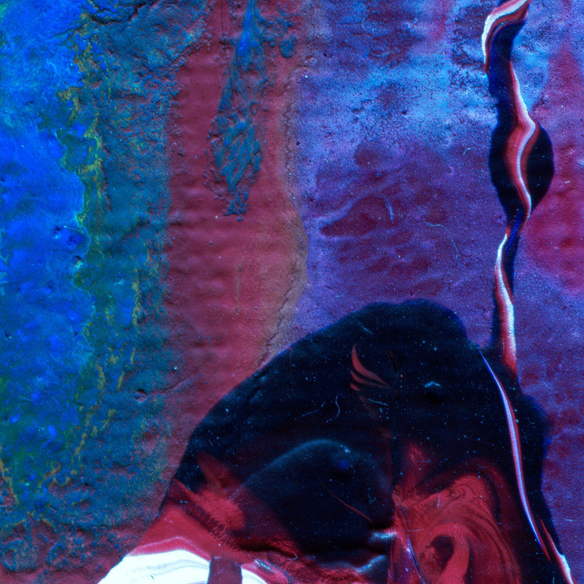
Creating Surreal Effect with Color Grading
Now, you might be wondering, ‘I’ve dabbled with black white Lightroom edits, but how do I infuse surrealism into my photos?’
Let’s take a walk through the vibrant lanes of color grading.
Color grading, in essence, is a powerful way to manipulate mood and atmosphere. Think of it as the digital equivalent of our prism experience. You are splashing colors and adjusting tones to carry your audience into a world of your making. We’ve all seen the brooding cobalt hues in a Tom Hooper movie or the rusty oranges in a Quentin Tarantino flick. That’s color grading rolling its magic.
‘Okay, I get that,’ you might say, ‘But how can I use it effectively in my photos?’
Two Basic Components: Color Correction and Color Look
In its core, color grading consists of two segments. First, you’ve got color correction. This is where you balance out your image’s color temperature, ensuring there are no stark gray or white imbalances. You’re aiming for a clean, ‘neutral’ look here.
Once you’ve achieved that, you proceed to the ‘color look.’ This is where the fun begins. You nudge the hues, twist the saturation, play with the contrast till you create an otherworldly vista that aligns with your vision.
Leveraging Adobe Photoshop for Color Grading
Photoshop offers a plethora of tools for effective color grading.
Let’s consider the “Color Balance” tool, for instance. It’s a three-tiered palette that lets you tweak tones in the shadow, mid-tone, and highlight ranges. Using this, you can easily create a surreal, cross-processed look.
Then there’s the ‘Selective Color’ tool that offers control over individual color channels. This lets you manipulate the intensity of specific hues, offering a detailed customization suite.
The potential doesn’t stop here, folks. You can experiment with ‘Gradient Maps’, ‘Photo Filters’, ‘Levels’, and ‘Curves’ among other features. The key here is exploration, playfulness, and an eye for detail. Try your hand at different tools, find the ones that resonate with your style, and soon enough, you’ll be creating spectacular fine art photos dancing with surreal aesthetics.
Wrapping it Up
As we come to the end of our journey, remember, there are no rules in art, only trails waiting to be blazed. Surreal fine art photography is just one pathway, a doorway into vibrant possibilities. So, dive in, experiment, and let the digital canvas reflect your innermost dreams. After all, aren’t we all dreamers trying to paint our visions into reality?
Let’s bring those dreams to life, one pixel at a time.
0 Comment