In the world of photography, creating the right atmosphere in your photo studio is essential. Not only does it set the mood for your clients, but it also has a psychological impact on their perception of your work. One of the most influential aspects of creating the right ambiance is choosing the perfect color scheme for your studio’s decor.
The Influence of Color
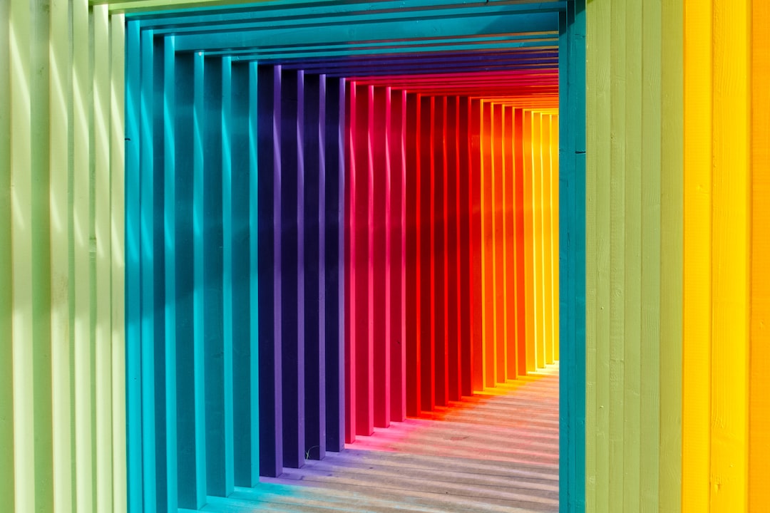
Color has a powerful influence on human emotions and behavior. Different colors evoke different feelings and can create various moods. Understanding the psychology of color can help you choose the right decor for your photo studio that aligns with your branding and the experience you want to provide.
Warm Colors for a Welcoming Studio
Warm colors like red, orange, and yellow are known to create a sense of warmth, energy, and excitement. They can be a great choice for creating a welcoming and inviting atmosphere in your photo studio.
Red is attention-grabbing and exudes passion and intensity. It can be used sparingly as an accent color to create a focal point or as a backdrop for stand-out shots. Orange radiates warmth and enthusiasm, making it an excellent choice for creating a friendly and energetic vibe. Yellow is associated with happiness and optimism, and it can add a cheerful and uplifting touch to your studio.
Cool Colors for a Calming Studio
Cool colors such as blue, green, and purple have a calming and soothing effect. They can create a serene and peaceful atmosphere in your photo studio.
Blue is often associated with tranquility and trust. Lighter shades of blue can create a sense of openness and spaciousness, while darker blues can add depth and richness. Green is reminiscent of nature and has a refreshing and rejuvenating effect. It can promote feelings of harmony and balance. Purple is often associated with luxury and creativity. It can add a touch of elegance and opulence to your studio.
Neutral Colors for a Versatile Studio
Neutral colors such as white, gray, and beige are timeless and versatile choices for a photo studio. They create a clean and minimalist backdrop that allows your subjects to take center stage.
White is associated with purity and simplicity and can create a sense of openness and freshness. Gray is elegant and sophisticated, and it pairs well with a variety of other colors. Beige is warm and inviting and can add a cozy and comfortable feel to your studio.
Choosing the Right Color Scheme
When choosing the color scheme for your photo studio, consider your target audience, your brand identity, and the emotions you want to evoke. Think about the type of photography you specialize in and the kind of experience you want to create for your clients.
Keep in mind that different colors have cultural associations and may have different meanings in different contexts, so research how certain colors are perceived in the culture or cultures you serve. You may also want to consider the color of your studio’s furniture and decor elements to ensure they harmonize with the overall color scheme.
Incorporating Colors in Your Studio Decor
Once you’ve chosen your color scheme, it’s time to incorporate those colors into your studio decor. Use paint, wallpaper, or fabric in your chosen colors to create an accent wall or add pops of color throughout the space. Consider using color psychology to guide your decisions, such as using warm colors in waiting areas to create a welcoming environment or cool colors in shooting areas to promote relaxation.
Additionally, pay attention to lighting in your studio. Different lighting conditions can alter the perception of color, so make sure your chosen colors look their best under the lighting setup you’ll be using.
Conclusion
The color scheme you choose for your photo studio has a significant impact on the atmosphere and perception of your space. By understanding the psychology of color and selecting the right decor, you can create a studio that not only showcases your photography but also enhances the overall experience for your clients.
0 Comment