Have you ever wondered how photographers achieve those vibrant, eye-catching colors in their images? The secret lies in the art of color grading. Color grading is the process of enhancing and manipulating the colors in a photograph to create a desired mood or aesthetic. It is a powerful tool that can completely transform the look and feel of an image, taking it from ordinary to extraordinary.
The Importance of Color Grading
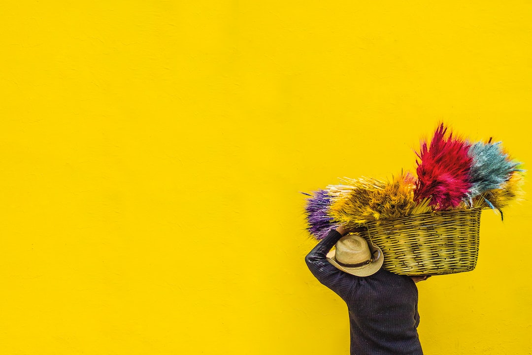
In photography, colors play a vital role in conveying emotions and capturing the viewer’s attention. They can evoke feelings of happiness, serenity, or drama, depending on how they are portrayed. Color grading allows photographers to have full control over the palette of their images, giving them the ability to enhance certain colors, create a harmonious color scheme, or even add a surreal and otherworldly look.
Color grading is not only about making an image visually appealing; it also helps tell a story. The choice of colors can signify the time of day, the location, or even the emotional state of the subjects. For example, warm tones like reds and oranges can evoke feelings of warmth, passion, or energy, while cool tones like blues and greens can create a sense of calmness, sadness, or tranquility.
The Process of Color Grading
Color grading can be done during the post-processing stage of photography using various software such as Adobe Lightroom or Photoshop. Here is a step-by-step process to help you master the art of color grading:
- Start with a Vision: Before you begin color grading, it’s important to have a clear vision of the mood or aesthetic you want to achieve in your image. This will guide your color choices and help you make consistent editing decisions.
- Adjust the White Balance: The white balance determines the overall color temperature of the image. It’s important to start with a properly balanced image before proceeding to color grading. Adjust the temperature and tint sliders to make sure the whites in your image appear neutral.
- Enhance the Primary Colors: Identify the primary colors in your image and enhance them to make them more vibrant. This can be done using the HSL (Hue, Saturation, and Luminance) panel in Lightroom or the Hue/Saturation adjustment layer in Photoshop.
- Create a Color Palette: Determine the color palette you want to use for your image. This can be achieved by adjusting the individual color channels, such as red, blue, and green, to create the desired effect. Experiment with different color combinations to find the perfect balance.
- Balance the Highlights and Shadows: Make sure the highlights and shadows in your image are properly balanced. This can be done using the Tone Curve or Levels adjustments. Balancing the highlights and shadows will help add depth and dimension to your image.
- Add Final Touches: Once you’re satisfied with the color grading, make any necessary final adjustments to exposure, contrast, and sharpness. Pay attention to small details to ensure a polished and professional look.
Color Grading Techniques
Color grading is a highly creative process, and there are countless techniques and styles that photographers can explore. Here are a few popular techniques to get you started:
- Warm and Vibrant: Boost the warm tones, such as reds and oranges, to create a bright and energetic look. This technique is often used in fashion and lifestyle photography to create a captivating and lively atmosphere.
- Cool and Moody: Enhance the cool tones, such as blues and greens, to create a moody and introspective look. This technique is commonly used in landscape and portrait photography to evoke a sense of tranquility or mystery.
- Desaturated and Cinematic: Reduce the saturation and add a subtle blue or teal tint to create a cinematic and nostalgic look. This technique is popular in film-inspired photography and can add a timeless and artistic feel to your images.
Practice Makes Perfect
Color grading is a skill that takes time and practice to master. Don’t be afraid to experiment and try different techniques to develop your own unique style. Study the work of other photographers and analyze their color choices to gain inspiration.
Remember, the goal of color grading is not to create unrealistic or unnatural colors, but to enhance and elevate the visual experience. Aim for a cohesive and balanced color palette that complements the subject matter and enhances the overall mood of your image.
Now that you’ve learned the art of color grading, it’s time to unleash your creativity and take your photography to the next level. Embrace the dance of colors and let your images come alive with the magic of color grading!
0 Comment