Remember that time when you took a breathtaking shot of a beach sunset? The sky ablaze with hues of orange, red and gold, the tranquil cerulean sea waving goodbye to the sun, and the silhouettes of palm trees adding a perfect note of contrast? And yet, when you reviewed that image on your computer screen, was it the same dramatic spectacle? More often than not, our photographs may not do justice to the enchanting scenes our eyes witness.
Here’s a surprising fact – Sixty-two percent of photographers believe that color grading is integral to creating impactful images, yet many fail to harness its full potential. Why so?
The Journey of Color Grading
Perhaps it’s because color grading, like any good wine, is an acquired taste – something that you, dear reader, can unlock and redefine in your photographic journey. I remember my first tryst with color grading, fingers hesitantly tweaking sliders in Adobe Lightroom editing workflow, trepidation giving way to exhilaration as I discovered an uncharted dimension of expressing my perspective. It was akin to learning a new language – lines of code and percentages morphing seamlessly into a symphony of colors that sang stories I had captured.
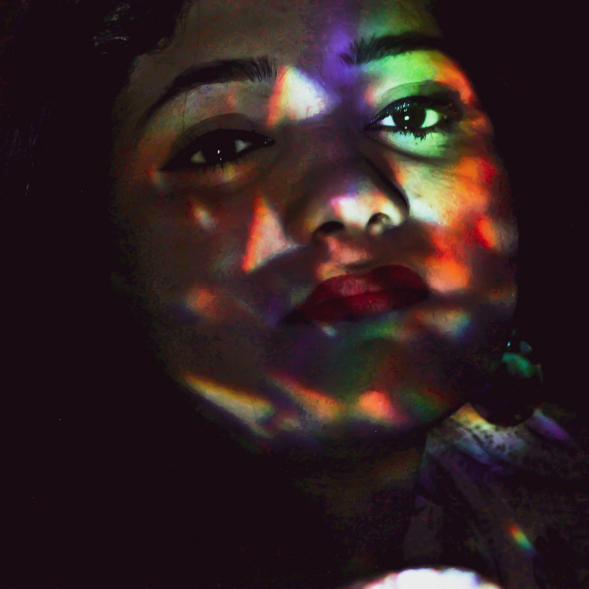
‘Colors, like features, follow the changes of the emotions’, Picasso once said. And it isn’t hard to see why. With the right use of color grading, you can instill mood, context, and personality that can change the narrative of your images drastically.
Unleashing the Power of Color
So, how do we unleash the power of color then? Before we delve into the ‘hows’, imagine this scenario: You’re at a picturesque lake right before sunrise. The sky, still shrouded in twilight blues, prepares to yield to the warm embrace of the sun. Now, wouldn’t it be something to capture the transition – the ethereal blues subtly morphing into a golden hue?
Enter color grading – your magic wand to stir emotions, evoke nostalgia, and tell intricately woven, immersive stories. It’s the very thing that turns ‘just a photograph’ into ‘your photograph’.
Start With The Basics
It all starts with understanding the basics of color theory. Primary colors, complementary colors, color harmony – you need a grip on these concepts first. And believe me, if the staggering hues of Van Gogh’s Starry Night or the evocative blues and greys in Picasso’s Blue Period art could talk, these masterpieces would likely sing praises about their creators’ understanding of color theory.
Color grading doesn’t change a photograph; it changes how we perceive it – not unlike how a film’s score might change how we perceive a scene.
Experiment and Discover
Once you’re comfortable with the fundamentals of color theory, it’s time to switch gears and let your creativity take the wheel. Think of your editing software as an artist’s palette – the hues present are boundless, waiting for your vision to mix, merge, and mold them into a visual extravaganza. Don’t shy away from taking unconventional routes, for it’s through ‘happy accidents’ that we often discover our unique style.
Crafting Your Unique Style
Have you ever noticed how some photographers seem to have a unique allure to their images that defines them? That’s the power of color grading at play. Crafting your unique style with color grading is like adding your signature, breathing a part of your soul into your creations, making them undeniably yours.
Here’s a whimsical thought: imagine your photographs as a person walking into a room. Does it blend with the crowd, or does it command attention, coaxing eyes to linger and appreciate the narrative?
Harness the Power of Color Grading
So, what’s holding you back? Dive into the world of color grading and give your images the life and depth they deserve. Remember: Color abhors monotony. Don’t merely capture objects, capture feelings, moods, and stories. Run wild with your imaginations, mix hues with audacity, and watch your photographs transform into captivating tales. Are you ready to unlock your creativity with color grading in photos?
0 Comment