Remember the last time you felt blue? I’m not talking about the feeling, but the color itself. Does it stir a certain mood within you? Quiet calmness, perhaps? Now, how about that fiery red hue your favorite sports car wears so proudly? Ah, the invincible thrill! Do you feel it? Here’s the thing about color – it’s not just a visual element. It speaks, invokes emotions, and creates the mood – especially important in crafted realities we call photoshoots. Would you believe that color can influence the way we perceive a fashion image? Intriguing, isn’t it?
Setting the Tone with Color Theory
Color in photoshoots works exactly like it does in a piece of art. It’s the painter lighting up the canvas, the conductor of photoshoot orchestration, directing eyes where to wander and emotions where to land. Let me give you a pose from my playbook. Imagine a model dolled up in vintage garb, but here’s the catch – the backdrop resonates with vivid pop art hues. Can you feel the tension? The fascinating juxtaposition!? That’s the drama color creates.
Ever peered into those starry-eyed fashion magazine spreads and wondered why they look so impeccably atmospheric? That, my friend, happens when you have your color theories down pat. It’s high time we start treating the color wheel not just as a tool, but as an inspired guide to invoke certain moods and convey the story we intend to tell. Pair it up with the power of playful photoshoots and what you get is the making of a stellar visual narrative.
The Prismatics of Emotion
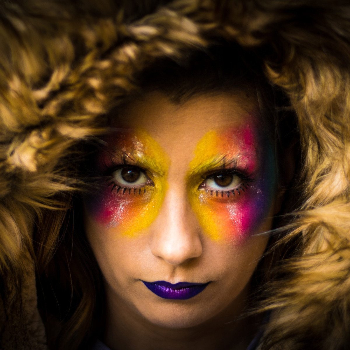
Let’s delve a bit deeper into the palette of possibilities we photographers have at our disposal. The color red, for instance, is quite the scene-stealer. It stands out, raises the heartbeat, commands attention – making it just perfect when you want your model to pop out from a busy scene.
On the flip side, use blues and greens when you’re crafting serene, ethereal shots. Imagine a dreamy fashion shoot by a tranquil lake, the model’s green dress complementing the serenity of the surroundings. That, right there, is visual Zen!
And let’s not forget the all-rounder – yellow. Warm, cheerful, but also tricky, it can help create energetic yet intimate shots. Just pay heed to the shadows as it can cast harsh, unflattering ones. Remember, it’s all about understanding the undertones each color carries and how they interact with each other within a frame.
Harnessing the Power of Color Schemes
Just as every note in a symphony contributes to the overall harmony, understanding color schemes and how they work together is key. Analogue, complementary, monochromatic – these aren’t just fancy words splashed across an artist’s diary. They are the secret keys to creating a visually compelling narrative, and we’ll explore those next. So, ready to dive into the colors, are you?
Let’s start with analogue colors – those that sit next to each other on the color wheel. Choose a base color, then pair it up with its adjacent colors to create a harmony that’s subtle and pleasing to the eye. Imagine an elegant, soft-toned fashion shot in hues of pale pinks and lavenders. Quite the calming spectacle, yes?
Waltzing with Colors
Now, to crank up the drama a notch, may I present you complementary colors. These are colors directly opposite to each other on the color wheel. Green and red, orange and blue, violet and yellow- when used together, they can create a high-contrast, dynamic look. It’s like heating up the dance floor with a passionate tango, where two opposites entwine, command, and captivate.
As we wrap up this color journey, let’s not miss out on the monochromatic scheme. One color, different shades. Simple, yet profound. Effective in creating focus and cohesion, if you’re looking to portray a story layered with emotions and subtlety, this scheme can be your perfect muse.
So, next time you’re staging an inspired fashion photoshoot, let not just the clothes and the model, but also the colors play their parts in your storytelling. Who knows what intriguing tales you can weave with just a brushstroke of colors?
0 Comment